
Campaign Logo Design
and Branding

Client
Saint John’s Cathedral (Denver)
Industry
Faith & Community
Services Provided
Logo Design, Brand Consultation, Application Mockups
The Background
Saint John’s Cathedral had just wrapped up a big financial campaign focused on revitalizing the church grounds, buildings and other physical infrastructure. Due to the year-long focus on revitalizing the physical structures and spaces, The Cathedral wanted to shift gears and bring the focus back to the community, people based programming and connection and needed a new campaign identity that reflected this shift.
The campaign was named “Take Care”, inspired by the personal way their deacon signed off every message — a subtle but powerful expression of community and compassion.
The Challenge
Designing a logo for a community-centered campaign within a multi-generational faith institution comes with a unique set of considerations:
The logo needed to feel warm, personal, and hand-touched
It had to be legible and accessible, particularly for older members of the community
Multiple stakeholders across diverse church groups needed to feel represented and have a voice in the process
The logo would be used across various applications — from bulletins and letterheads to digital communications and signage
The Process
Unlike my typical process (which begins with a primary design direction based on a mood board), this project called for a more collaborative and flexible approach:
Multi-Directional Concepts
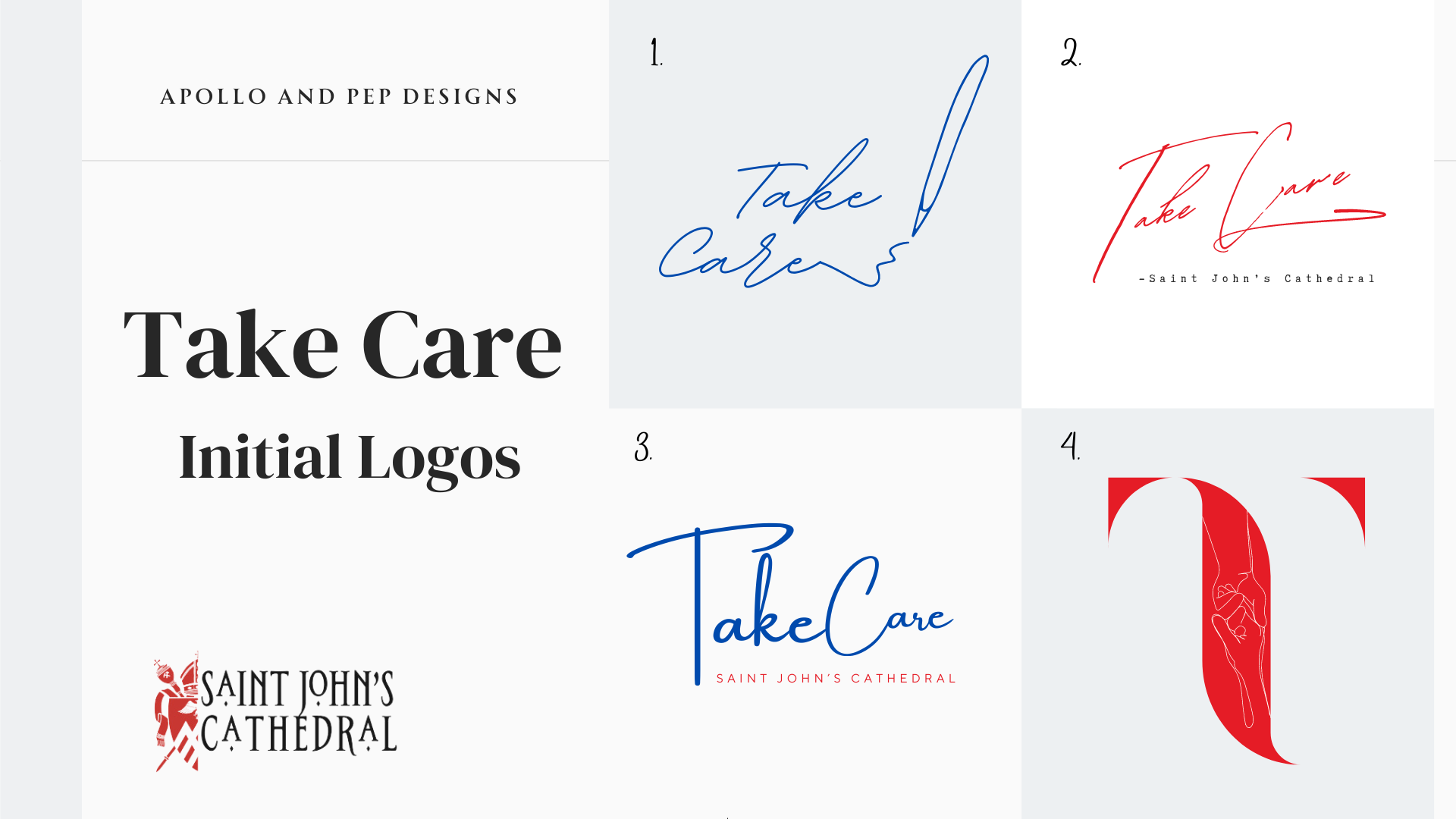
At the client’s request, I presented four distinct logo directions — each reflecting a different tone and focus:
A handwritten design focused on personal care and warmth
A text-focused version prioritizing clarity and structure
A design that blended traditional church aesthetics with a softer touch
A modern minimalist take, for digital-forward applications
Each logo concept was accompanied by a quick application sheet to help decision-makers visualize how it would translate across formats (e.g., websites, print material, signage).
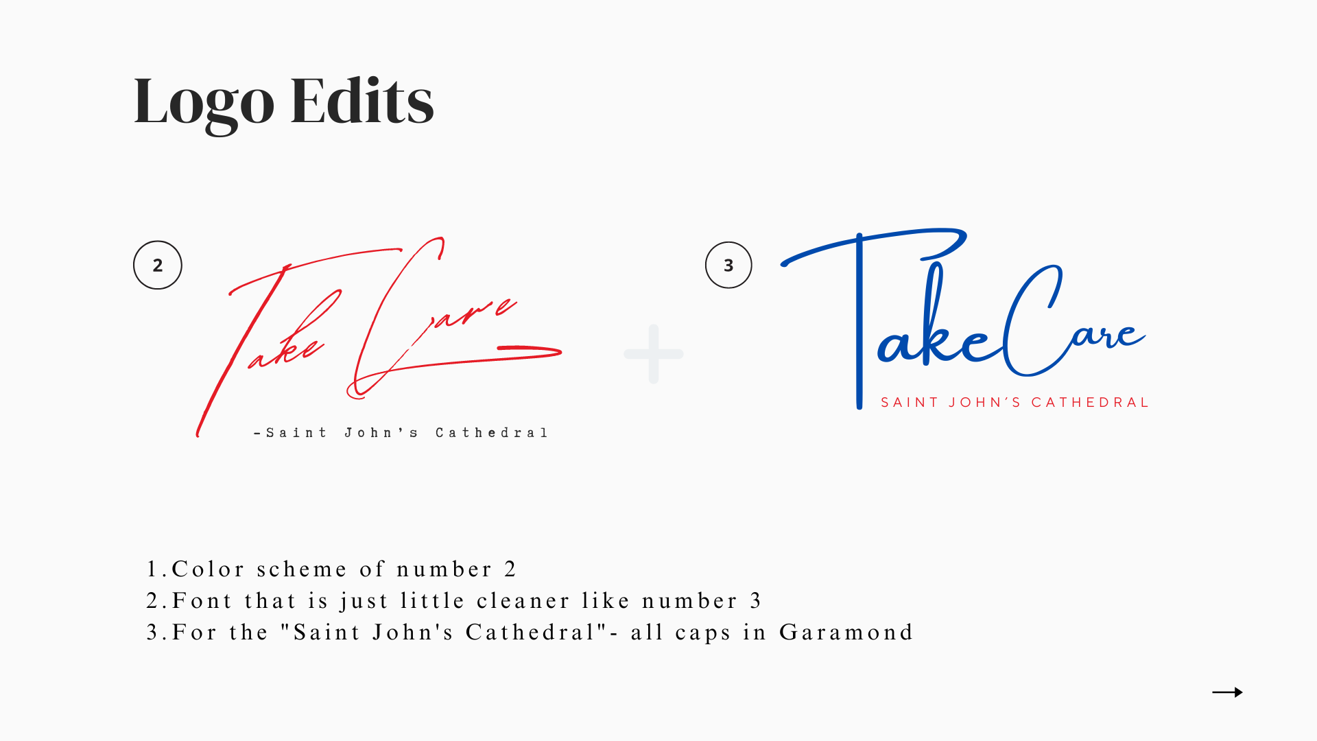


The Final Design
After extensive community input and refinement, we landed on a handwritten-style wordmark reading “Take Care”, paired with classic supporting typography to ensure clarity and timelessness.
This final design achieved the perfect balance:
Approachable and heartfelt, reflecting the campaign’s mission
Readable for all ages, with careful typographic choices
Flexible for all uses, from banners to bulletins
Deliverables
To ensure a seamless handoff, Saint John’s Cathedral received a comprehensive logo package that included:
AI master file with all logo versions and application formats
Organized ZIP folders with PNG, SVG, PDF, and EPS files for each use case
A detailed PDF presentation outlining the design process, strategy, and rationale
My signature “Client File Format Guide”, explaining when and how to use each file type

Reflection
The “Take Care” logo project was a powerful reminder that great design isn’t just about visuals — it’s about honoring the voices behind a mission. It was a privilege to create an identity that reflects the heart of this Cathedral’s community and helps carry their message of community, compassion and stewardship into the next chapter.
